Nature-inspired colours are trending in 2025, and they're changing how we work
Have you noticed that earthy tones are everywhere right now? Olive green on the runways. Burnt sienna sofas. And beige everything: wireless headphones, linen bedding, trendy sneakers.
Natural colour palettes are on the rise in architecture and interior design, too. Pantone, the global authority on colour in design, has named Mocha Mousse its 2025 Colour of the Year, while paint brands like Behr and Benjamin Moore are embracing clay, sage, and a whole lot of brown.
As we gravitate towards more grounded tones, what does that mean for the look and feel of modern workplaces?
To unpack the commercial colour trends of 2025, we spoke with Lily Ng, Product Consultant at Bremworth, a premium New Zealand carpet and rug brand known for its design-led wool flooring and strong sustainability ethos.
Lily shares how ‘resimercial’ workspaces, biophilic design, and colour psychology are leading to smarter, more inclusive work environments.

Lily Ng, Product Consultant at Bremworth
Lily, I’d love to know what resimercial means! But first, can you tell us about your role at Bremworth and what inspires your creative process?
I design and curate the carpet and rug collections here at Bremworth. I monitor what is happening in the world of interiors and ensure our product range stays relevant to the Australasian market.
Like most designers, I often find inspiration in nature. Sometimes, it can come through an object, something as simple as a piece of pottery, a photo, or a painting. From there, I keep adding colours until I have a cohesive palette.
What design trends and commercial colour palettes are emerging in 2025?
Historically, blues and greys were the staples of commercial interior colour palettes, and the colours rarely veered from this. However, post-COVID, a new trend is taking over: ‘resimercial’.
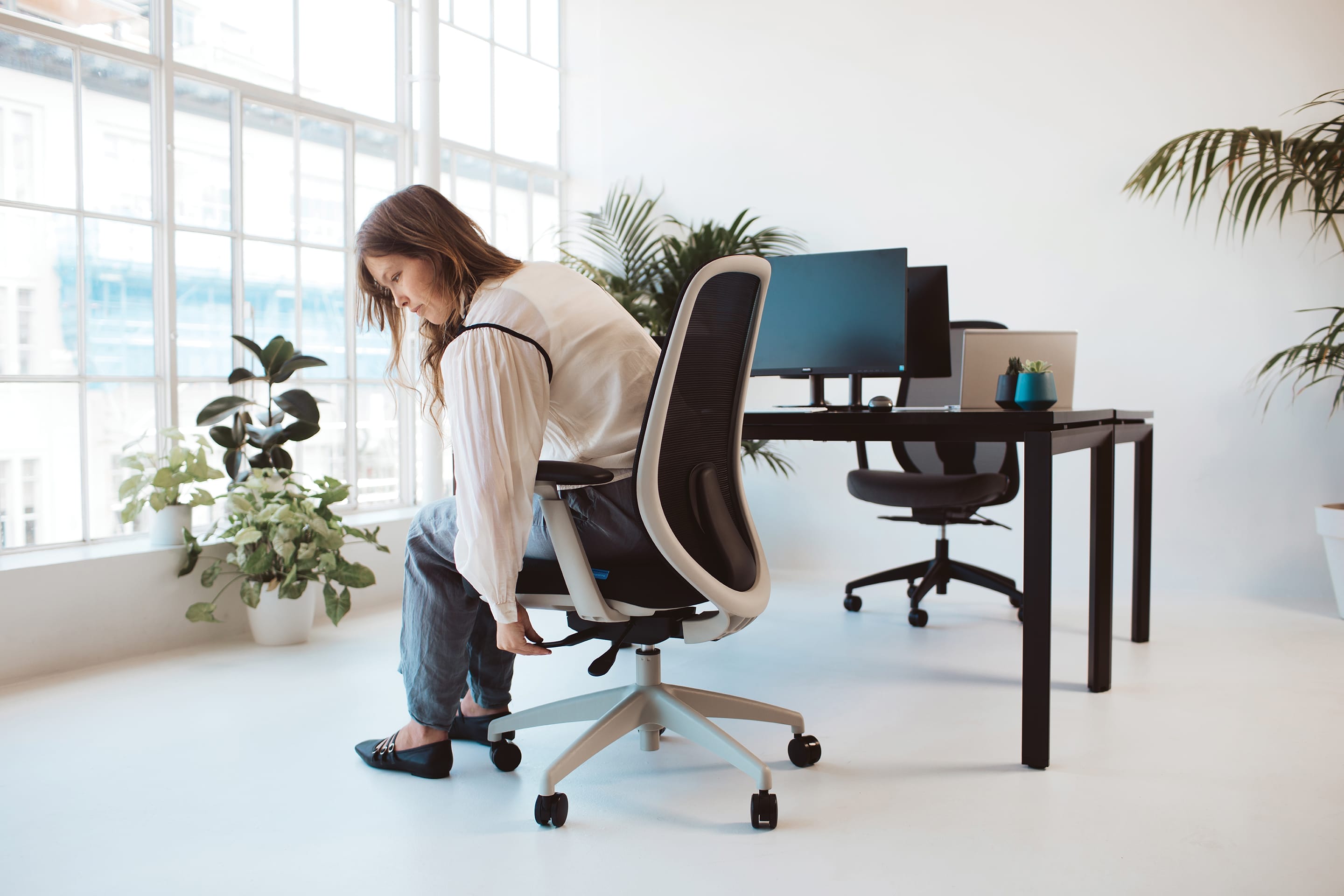
Resimercial office design is the blending of residential comforts with commercial function. In other words, making the office more homely. Commercial spaces are getting lighter, brighter, and warmer. We’re moving away from looking overly corporate to entice work-from-home staff back into the office.

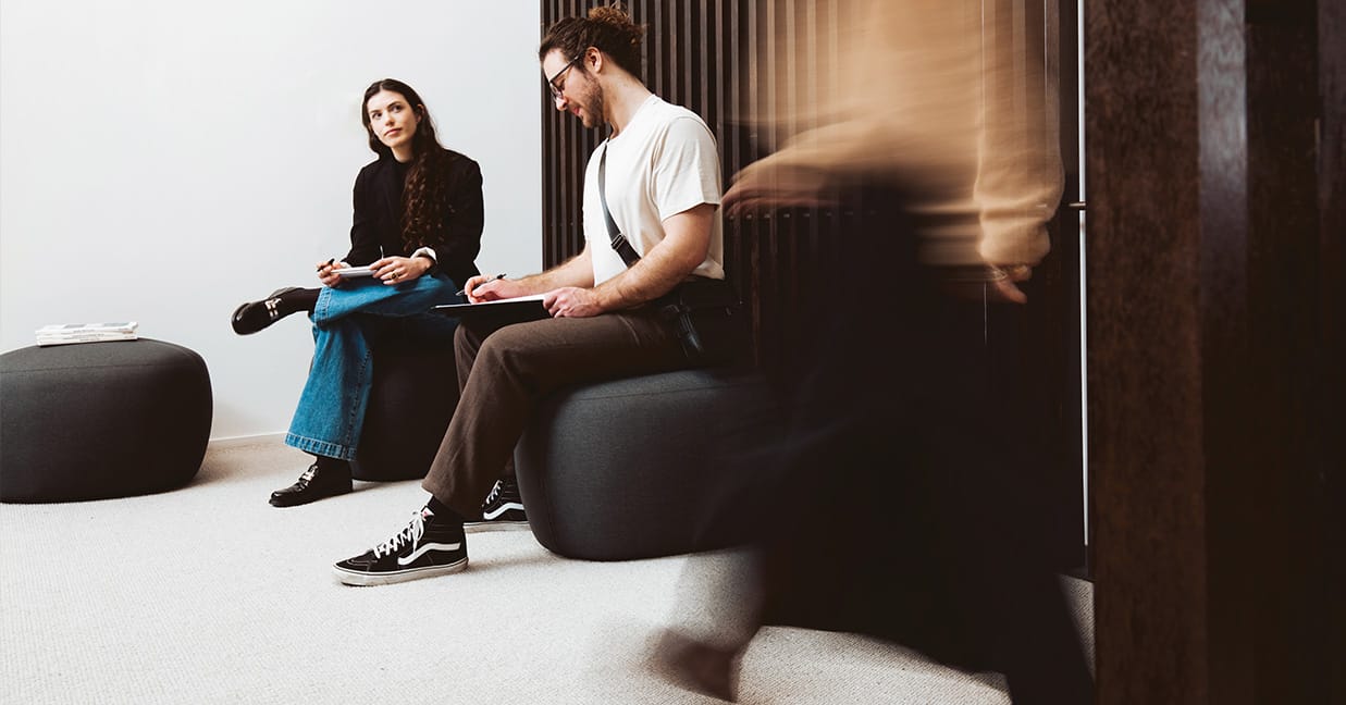
With its playful geometric shape and structured support, the Konfurb Gem ottoman lends itself to spontaneity and collaboration, while bringing a residential touch to the modern office.
Are there particular tones that work well in workspaces?
Green and blue office interiors are always popular, and I’m particularly drawn to green. Whether it’s paint, flora, carpet, or soft furnishings, green brings freshness to any interior. Green hues open up a space and evoke a sense of calm.
Colours found in nature also tie in well with another popular design approach: biophilic design.
Biophilic colour design is about bringing the feel of the outdoors in. That could be through sustainable workspace furniture, indoor plants, and colour palettes that reflect the natural world.

Available in a range of upholstery options, the Buro Roma chair pairs effortlessly with earthy tones, ideal for focus-friendly, nature-inspired workspaces.
How do interior designers tackle colour when it comes to flooring?
Flooring is one of the bigger investments in a space, so there tend to be two opposing approaches. It depends on the individual designer and what the client wants.
One option is to play it safe with flooring and then bring colour in through furniture or accessories.
Or, you can do the opposite. Flooring is one of the first things you notice when entering a room, so if you want to make a statement, a bold carpet will certainly do it.

The Konfurb Neo chair offers a professional look in grey tones and effortlessly complements neutral wool carpets.
How can colour support productivity and wellbeing in a workspace?
There’s a lot of psychology and science behind the use of colour palettes and how they impact commercial interiors. With so many diverse individuals in the workplace, we need to put thought into every room we design and cater to the different ways people work.
Productivity through colour is an interesting concept. Green and blue office interiors can promote productivity and focus. Red, on the other hand, may inject energy but can also trigger anxiety.
Soft, muted pastel colours are more neurodiverse-friendly than, say, a room filled with saturated colours.
At Bremworth, you work closely with architects and designers. How does this influence your approach to colour?
The beauty of collaborations is that you get a glimpse into how another designer approaches a project.
Our Ahuru collection is a great example. We partnered with designers I admire and gave them the freedom to create colours they felt would work beautifully as carpet. They chose colours I wouldn’t have thought to use myself. The results were really refreshing!
Ahuru Wool Carpet Selection


Āhuru is a soft plush pile with a velvety appearance that evokes luxury.
Do you have a prediction about commercial colour design for the year ahead?
The resimercial office design movement continues to grow, with warmer, lighter interiors that support wellbeing becoming more common. Read more about designing smarter workplaces for hybrid teams.
Sustainability is also playing a bigger role in design decisions: recycle, re-purpose, reuse. Full circularity. Quality products that last. So expect to see earthy, natural tones that reflect craftsmanship and a sense of provenance.
And remember, sticking too closely to what’s worked in the past can sometimes feel a little cookie-cutter. Designers who take thoughtful risks with colour can elevate a space and set it apart.

Ready to reshape your workplace?
From flooring to furniture, every detail shapes how a space feels. Speak to Buro about bringing it all together.